echart-plotlib 一个简单好用的绘图库
-
自己封装的一个echart3的绘图库,目前支持折线图,饼图,柱状图,面积图,堆积柱状图,堆积面积图等, 美观简单易用, 非常适合使用jupyter画图,欢迎star.
https://github.com/lizekang/echart-plotlibechart-plotlib
A simple api for using echart in jupyter notebook. You can use these apis to plot line, stack, bar or pie. It's just for daily simple use. Welcome to contribute other echart plot options.
How to use it?
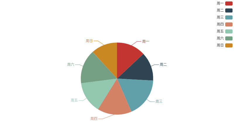
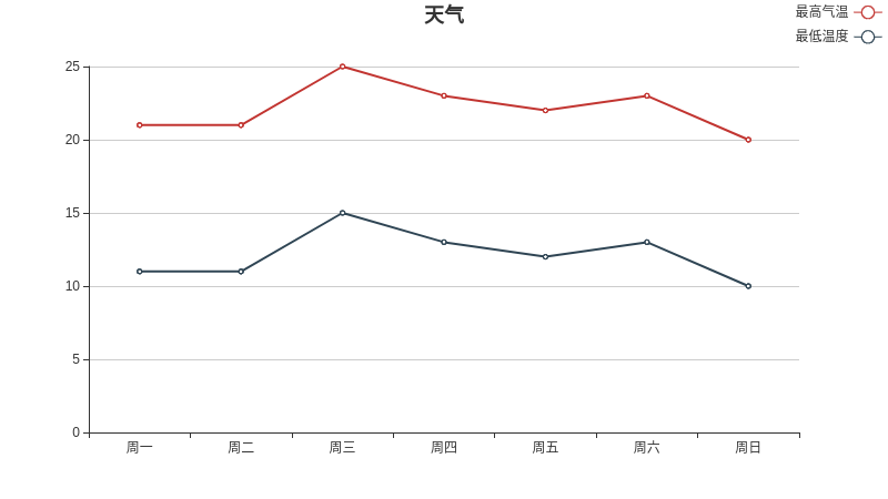
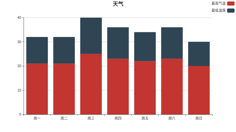
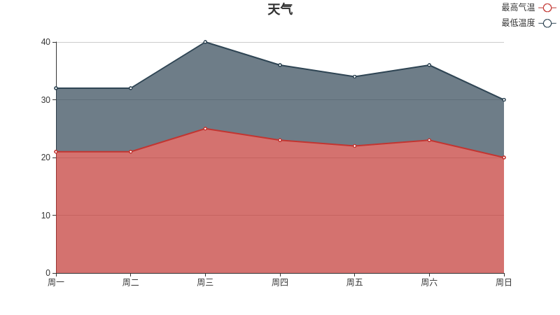
# test in jupyter notebook
from echartlib import echartlib
from IPython.display import HTML
echart = echartlib(width=800, height=450)
# plot line, and you can choose stack or tiled, bar or line in the graph
data_name = ["最高气温", "最低温度"]
xAxis_data = ['周一','周二','周三','周四','周五','周六','周日']
yAxis_data = [[21, 21, 25, 23, 22, 23, 20], [11, 11, 15, 13, 12, 13, 10]] # two dimension
HTML(echart.plot_line(data_name=data_name, xAxis_data=xAxis_data, yAxis_data=yAxis_data, title="天气"))

# plot area, and you can choose stack or tiled, bar or area in the graph
data_name = ["最高气温", "最低温度"]
xAxis_data = ['周一','周二','周三','周四','周五','周六','周日']
yAxis_data = [[21, 21, 25, 23, 22, 23, 20], [11, 11, 15, 13, 12, 13, 10]] #two dimension
HTML(echart.plot_else(data_name=data_name, xAxis_data=xAxis_data, yAxis_data=yAxis_data, title="天气"))

# plot pie
data_name = ["最高气温", "最低温度"]
data = [10, 20]
HTML(echart.plot_else(data_name=data_name, data=data, title="天气"))
Example
- pie
- line
- stack bar
- stack area
-
这个可以话散点图么
-
还没加这个功能...
-
最近在前端数据可视化用echarts哎~
话说这个和echart_python有啥区别啊
-
@lovegood 我封装了一层前端的echart,能让它在jupyter里面用